Browsing Trust at High Velocity

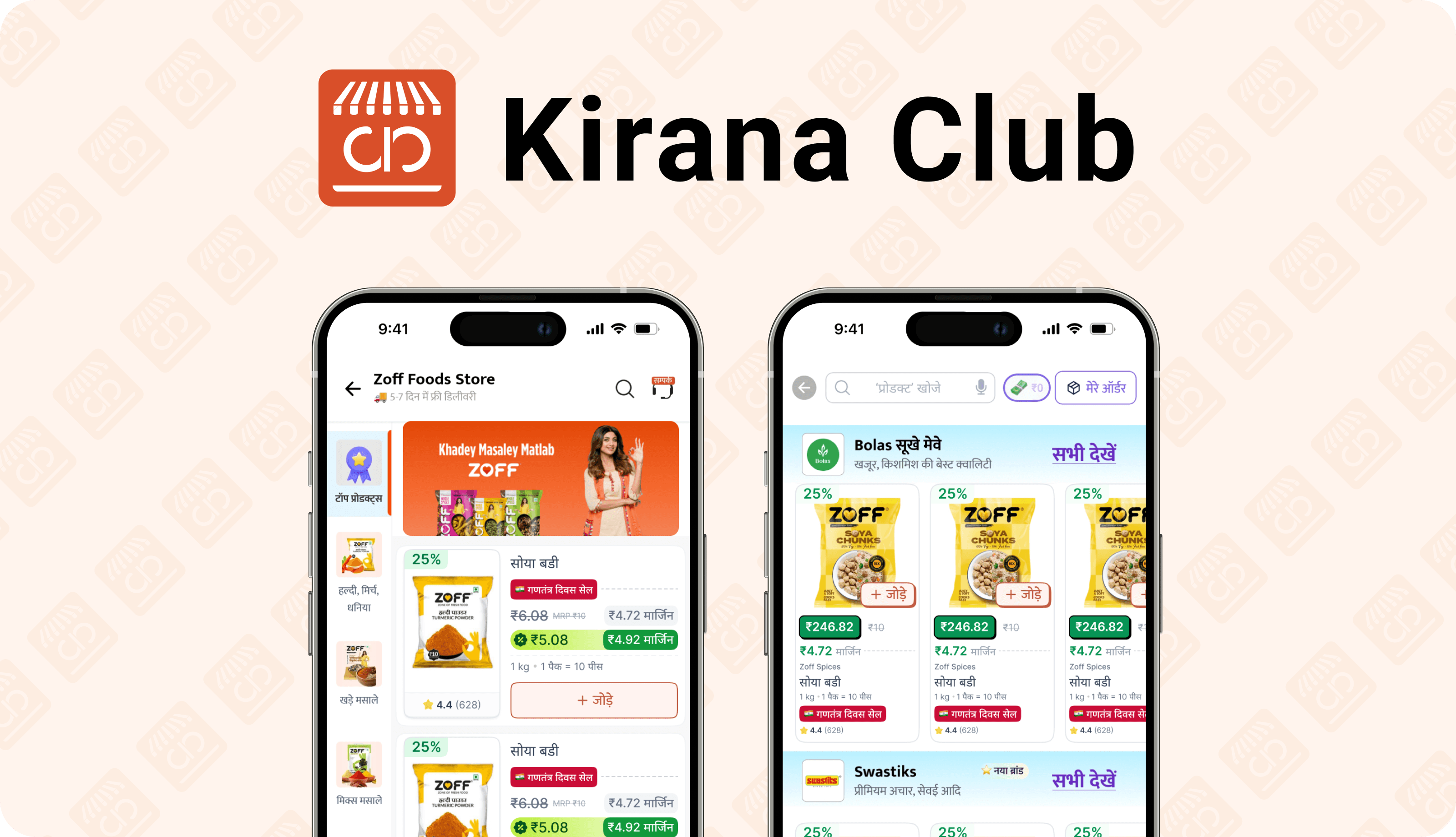
A strategic redesign of the PLP to maximize screen real estate, reduce variant selection friction, and build trust through dynamic signals and vernacular communication.

E-Commerce

CRO

UIUX Redesign

Browsing Trust at High Velocity

A strategic redesign of the PLP to maximize screen real estate, reduce variant selection friction, and build trust through dynamic signals and vernacular communication.

E-Commerce

CRO

UIUX Redesign

Browsing Trust at High Velocity

A strategic redesign of the PLP to maximize screen real estate, reduce variant selection friction, and build trust through dynamic signals and vernacular communication.

E-Commerce

CRO

UIUX Redesign

OVERVIEW

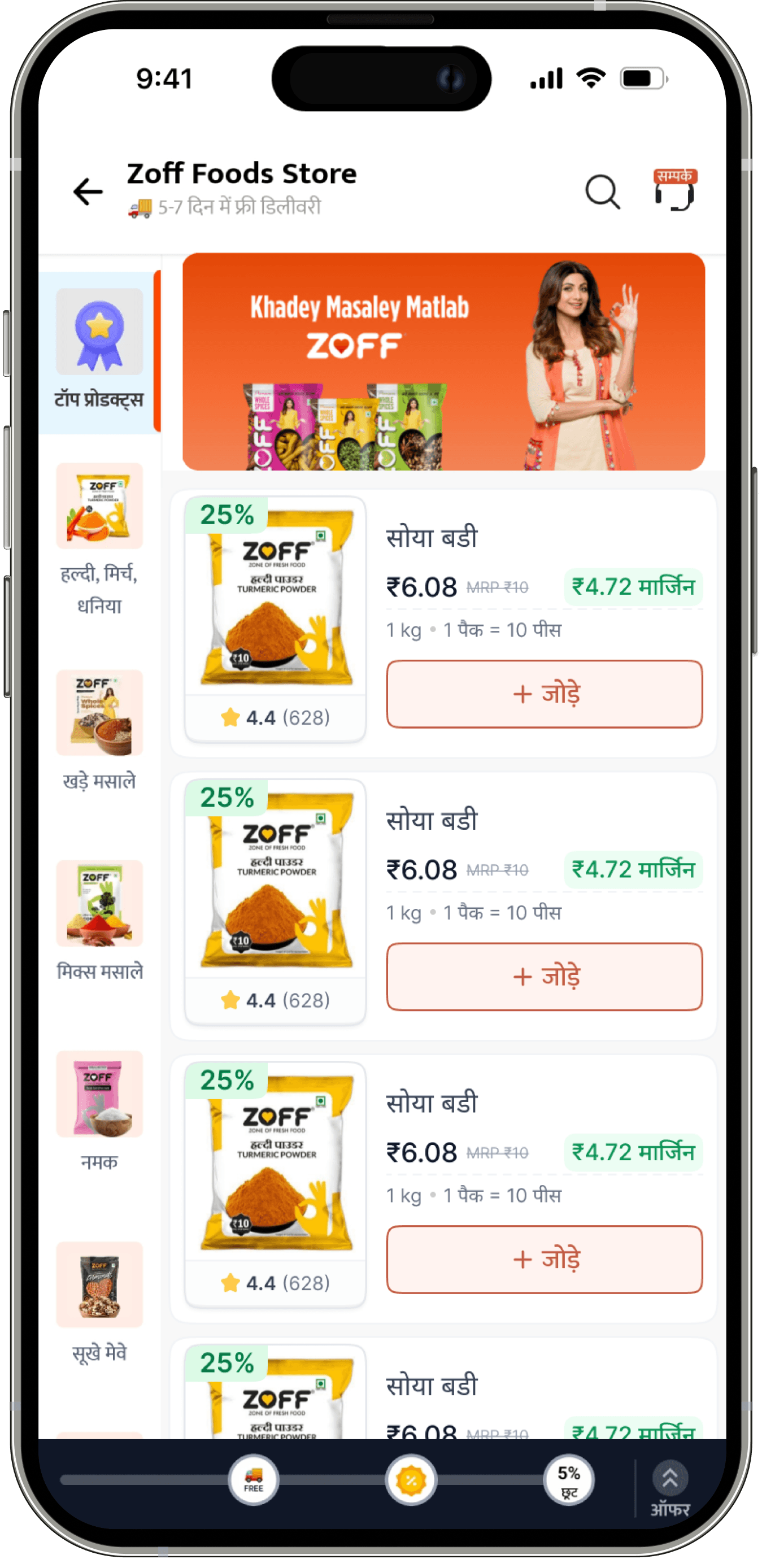
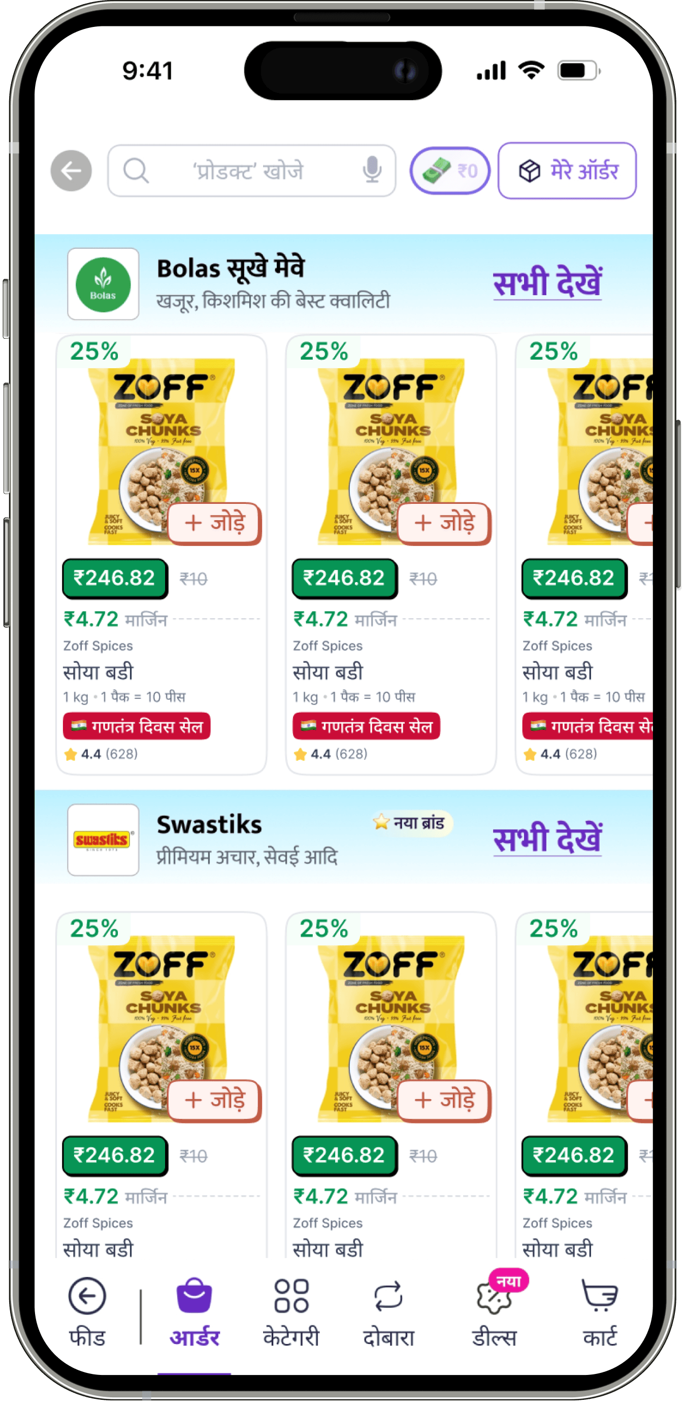
The Product Listing Page (PLP) at Kirana Club is the primary storefront for brand-specific browsing. However, despite high traffic, high-intent visitors were dropping off due to discoverability gaps and interaction friction. The page needed to do three things effectively: help users parse variants quickly, understand their savings immediately, and add products to the cart with zero hesitation. We redesigned the experience to balance information density with clarity, moving from a standard list view to a high-velocity, trust-forward interface.

CHALLENGES

  • Interaction Friction: Selecting a simple size variant required too many taps, breaking the shopping flow for bulk buyers.

  • Space Inefficiency: The previous layout wasted vertical screen real estate, forcing users to scroll excessively to find products.

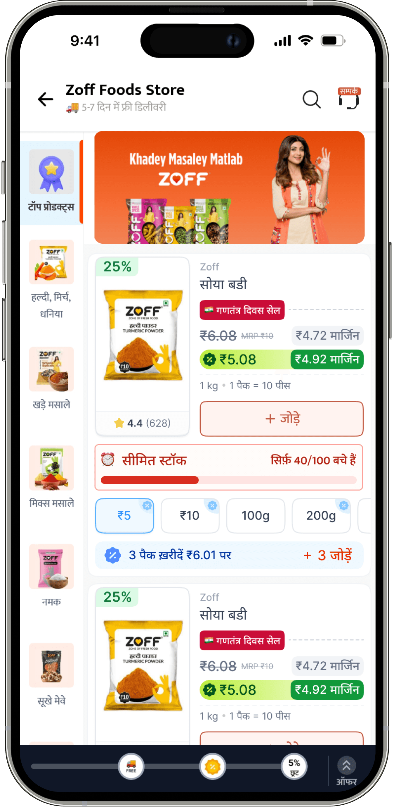
  • Offer Blindness: Users frequently missed Minimum Order Value (MOV) benefits because the progress indicators were subtle and disconnected from the purchase action.

  • Trust Gaps: New brands struggled to convert because the UI lacked "authenticity signals" like ratings, reviews, or brand videos.

GOALS

  • One-Tap Decisions: Redesign SKU cards to allow variant selection and add-to-cart actions with a single click.

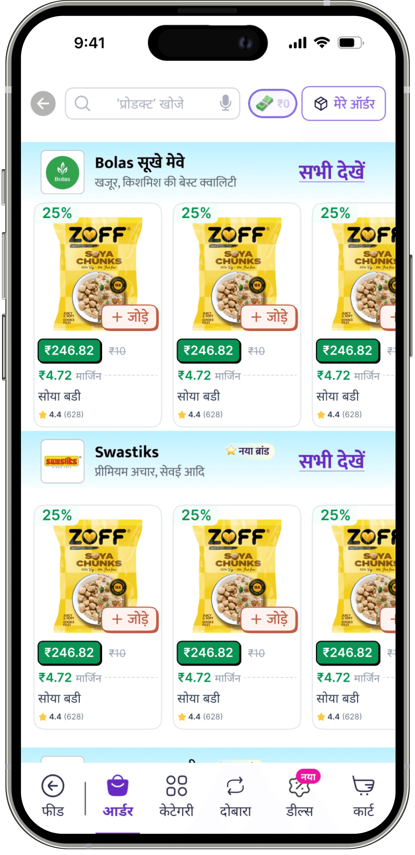
  • Maximize Density: Implement a two-column grid layout to double product visibility per scroll without cluttering the UI.

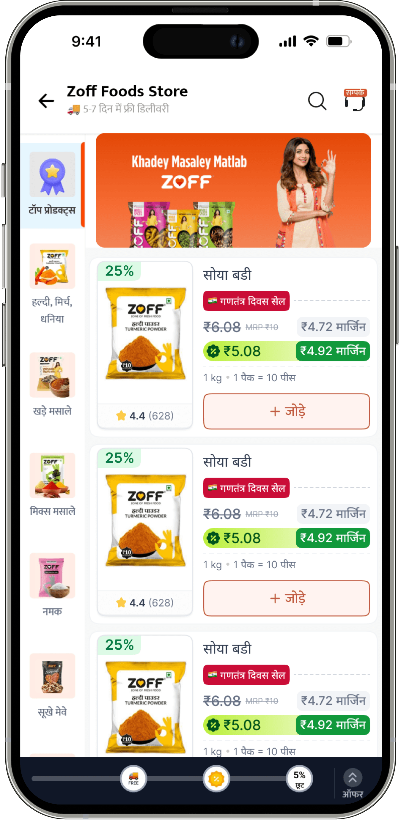
  • Dynamic Communication: Introduce rotating tags on product cards to communicate offers, sales, and trust markers in real-time.

  • Vernacular Trust: "Speak the user's language"—literally—by localizing content and adding video carousels to humanize the digital shelf.

MY ROLE

Lead Product Designer I owned the end-to-end design process, from conducting user calls to define the friction points to executing the high-fidelity UI.

I collaborated directly with PM to align the funnel optimization strategy with technical feasibility, specifically focusing on the card architecture and merchandise logic.

DURATION

4 Weeks (Concept to Integration)

TAKEAWAYS & LEARNINGS
📊

Data Can Be Faster Than Talk

While user calls are vital, I learned that large portions of the funnel puzzle, like "most popular sizes", are better solved by validating sales data than by asking users what they might buy.

😰

Designing Pressure is Intentional

Replicating interview anxiety isn’t just UX, it’s psychology. Timers, interruptions, and limited tools had to feel stressful but fair.

😰

Designing Pressure is Intentional

Replicating interview anxiety isn’t just UX, it’s psychology. Timers, interruptions, and limited tools had to feel stressful but fair.

🗣️

Speak Their Language (Literally)

"Hygiene" in design isn't just about white space; it's about semantic clarity. Writing copy in the exact vernacular/dialect of our users built more trust than any visual polish could.

🧠

Multimodal = Modular Thinking

"Hygiene" in design isn't just about white space; it's about semantic clarity. Writing copy in the exact vernacular/dialect of our users built more trust than any visual polish could.

🧠

Multimodal = Modular Thinking

"Hygiene" in design isn't just about white space; it's about semantic clarity. Writing copy in the exact vernacular/dialect of our users built more trust than any visual polish could.

🧩

Structure Over Space

In high-velocity shopping, density is a feature, not a bug. Refactoring the card from a list to a two-column grid taught me that users prefer seeing more options quickly over seeing fewer options beautifully.

🧩

Structure Over Space

In high-velocity shopping, density is a feature, not a bug. Refactoring the card from a list to a two-column grid taught me that users prefer seeing more options quickly over seeing fewer options beautifully.

🧩

Structure Over Space

In high-velocity shopping, density is a feature, not a bug. Refactoring the card from a list to a two-column grid taught me that users prefer seeing more options quickly over seeing fewer options beautifully.

🏷️

The Power of Dynamic UI

Static labels get ignored. We introduced a "Dynamic Rotating Tag" on the product card. This animated element became a prime focus area for communicating urgent sales and trust pointers without taking up extra pixels.

🏷️

The Power of Dynamic UI

Static labels get ignored. We introduced a "Dynamic Rotating Tag" on the product card. This animated element became a prime focus area for communicating urgent sales and trust pointers without taking up extra pixels.

🏷️

The Power of Dynamic UI

Static labels get ignored. We introduced a "Dynamic Rotating Tag" on the product card. This animated element became a prime focus area for communicating urgent sales and trust pointers without taking up extra pixels.

🧠

Trust Your Gut (When Validated)

There’s a balance between PM input and design intuition. I learned that sometimes you have to push for a pattern (like the video carousel) based on "gut" instinct about trust, even if the immediate data doesn't explicitly ask for it.

🧠

Trust Your Gut (When Validated)

There’s a balance between PM input and design intuition. I learned that sometimes you have to push for a pattern (like the video carousel) based on "gut" instinct about trust, even if the immediate data doesn't explicitly ask for it.

🧠

Trust Your Gut (When Validated)

There’s a balance between PM input and design intuition. I learned that sometimes you have to push for a pattern (like the video carousel) based on "gut" instinct about trust, even if the immediate data doesn't explicitly ask for it.

Urgency is a Design Pattern

We built specific UI states for flash deals and limited-time variants. I learned that visual urgency needs to be distinct from standard "out of stock" warnings to drive action rather than frustration.

Urgency is a Design Pattern

We built specific UI states for flash deals and limited-time variants. I learned that visual urgency needs to be distinct from standard "out of stock" warnings to drive action rather than frustration.

Urgency is a Design Pattern

We built specific UI states for flash deals and limited-time variants. I learned that visual urgency needs to be distinct from standard "out of stock" warnings to drive action rather than frustration.

Copyright @2025

Made with

&

with ❤️ & ☕

Make it Pop!

Copyright @2025

Made with

&

with ❤️ & ☕

Make it Pop!

Copyright @2025

Made with

&

with ❤️ & ☕

Make it Pop!